COLOUR MIXING FOR ARTISTS AND ASPIRING ARTISTS
Colour Mixing is a skill that is absolutely crucial for artists to learn with confident proficiency. The artistry of color mixing is not a mere trifling matter, but rather a fundamental cornerstone upon which your painting confidence stands. There is too much poor information and misinformation ‘out there’ to rely on using that to learn. Colour Mixing confidence can light up the path towards creating exciting and new colour palettes. These vivid visual expressions which will truly invigorate your work.
If we want to become an artist we accept that we need to learn to draw. However, isn’t colour something we all know about from when we are infants? Why do we need to learn about colour? The simple answer to this is that we learn an overly simplified version of colours that is somehow never truly corrected as we get older. In kindergarten we learn the colours red, blue, yellow, orange, green and purple. We don’t learn about the different shades of red, magenta. Hues of green like viridian. Shades of blue like teal or ultramarine. We don’t learn warm yellows, like cadmium or citrus yellows like lemon. This is why, for example, most adults will tell you that red and blue make purple. Heads up, they don’t. They make a brown. This is why colour mixing fails for so many people and they end up using a very limited version of the colours that are possible. And often their colour mixing can be rather muddy.
THE PURPOSE OF THIS ARTICLE
The purpose of this article is to highlight the importance of learning about Colour Mixing and Colour in Art. This will make your painting so much more interesting than you ever could have imagined. When we learn, we need to learn from a trusted source. If we had a car that needed a repair would we take it to a free mechanic, a cheap mechanic or a trusted mechanic? I take my car to the mechanic who lives in my road in my village. This is not because he is local but because he lives or dies by his reputation so I know he does his best job. Always and consistently. At Bradness Gallery, it is the same. We are a small thriving business. We do not have an advertising budget. We live by our reputation and personal recommendations.

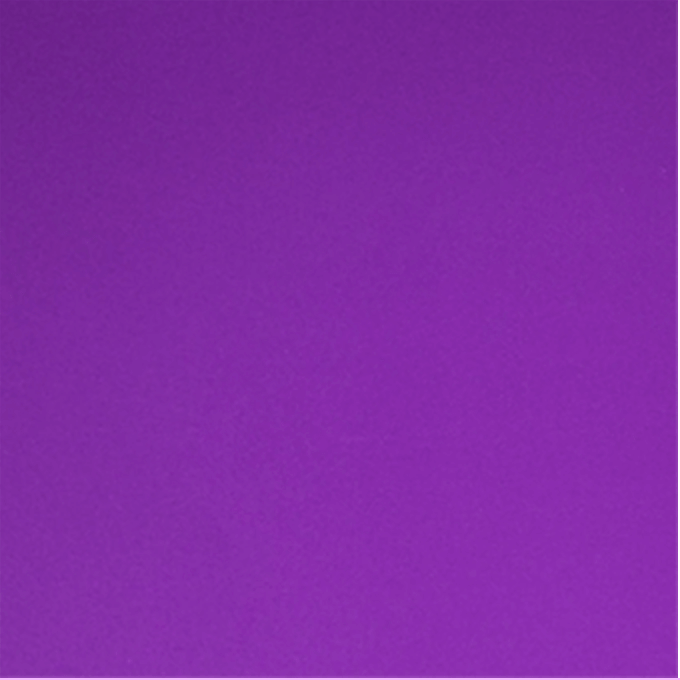
Red and Blue make a colour like this
Magenta and Ultramarine Blue make a colour like this
COLOUR MIXING FOR ARTISTS - IS FREE INFORMATION WORTH THE INVESTMENT?
FREE INFORMATION vs TRUSTED INFORMATION.
In todays’ world, free information is freely available to all of us. We can ‘google’ anything and look up tutorials on You Tube. There are an extraordinary range of topics from fixing the washing machine to dancing a Salsa. Some free information is fabulous and some paid for information is poor or incorrect. What we need to know is the quality of the information.
IS IT RIGHT OR DOES IT JUST HAVE THE RIGHT ALGORITHM. We can ‘google’ Landscape Painting and the images below are the first to come up. No disrespect to the artists shown below, but the world’s most famous landscape artists, such as, JMW Turner, John Constable, Cezanne, Monet, Wassily Kandinsky, David Hockney and Van Gogh, don’t get a look in. Yet they are considered to be among the best landscape painters in history. The ones that first come up do so because the internet search bots liked their Search Engine Optimisation not because they were quality Landscape paintings. With AI all this is about to get worse. Nobody will know what on earth to trust. So from now on, you really do need to know your subject in order to ask the right questions. You need to know whose information is going to be top quality and trusted whose is just tosh with a good algorithm.
REPEATED MISCONCEPTIONS
There are many repeated misconceptions that have been repeated and repeated for decades or longer. An idea is picked up and repeated without being challenged. For example, the idea that we only use 10% of our brains. This misconception is explored in the BBC programme More or Less on the 2nd September 2023 and in this article by Claudia Hammond on BBC Future. The same applies to the repeated misconception that red and blue make purple.
Our most valuable asset is our time. So whether we want to paint as a little hobby or become a professional artist what we want to do is learn properly. Go to the best source for the information you want to learn. Art historians or art writers are not necessarily practical painters so their knowledge base is different. The book Blink by Malcolm Gladwell, the New Yorker writer explores facts and intuition.
WHAT COLOURS MAKE PURPLE. The proof of the pudding is in the eating. Give it a try. Try mixing red and blue together and see what colour you get. Now try mixing magenta and blue and see what colour you get. For this experiment, I would suggest you use a Cadmium Red and an Ultramarine Blue and then a Magenta and an Ultramarine Blue.
COLOUR MIXING BY TWO WORLD FAMOUS LANDSCAPE ARTISTS

Above: Autumn Poplars by Claude Monet
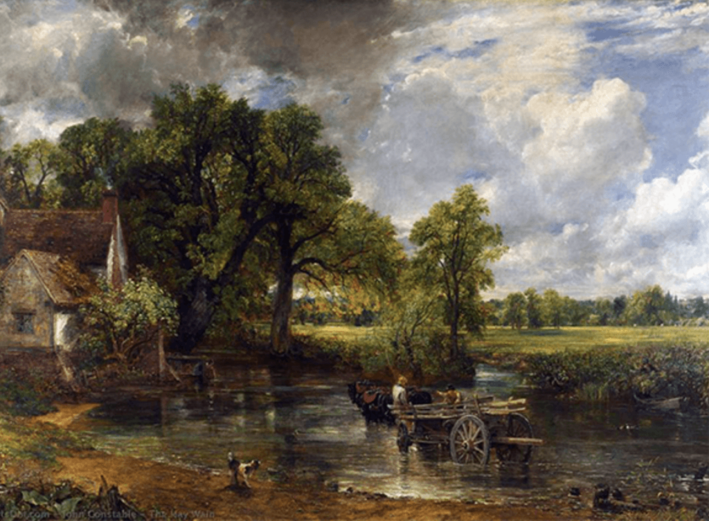
Above: The Hay Wain by John Constable
LANDSCAPE PAINTINGS 'BY' GOOGLE
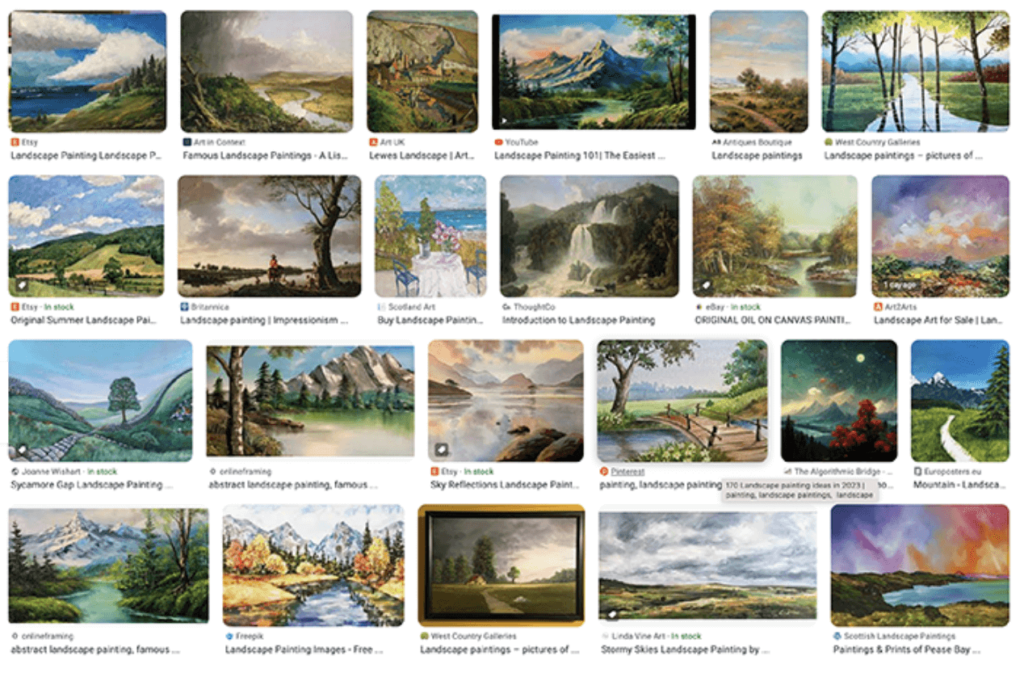
These are the page 1 images thrown up by the search ‘Landscape Paintings’. Of course, appreciation of art is subjective so whilst I am passing no judgement, almost none of them are by history’s most famous and distinguished painters. They appear on page 1 because something in their algorithm puts them there rather than the quality of the painting.
This applies to everything we see online.
This is why I created my ONline Colour Mixing course because I want people to properly learn and understand how to mix colours. If you are given false or limited information on mixing colours then it limits your future use of colour in art.
With the advent of AI and Chat GPT this issue will increase massively. How will we know what is a trusted source of information. A conundrum for all of us
COLOUR MIXING FOR ARTISTS CAN BE INCORRECT
The reason, I created my Colour Mixing Tutorials Course is because there is just so much misinformation out there on the subject. I watch videos with absolute horror that have had hundreds of thousands of views and likes. The people watching them don’t know the subject and neither does the person who has made the video or written the article. I don’t wish to be sued here as I don’t have the backing funds of Private Eye so I have to be careful and not mention specifics. I read a book about Colour in Art that was serialised on radio 4. Firstly the author said that Red and Blue make Purple, which they don’t and I will explain that in more detail later. Secondly, they said that Hookers green was the perfect green of painting landscapes. Well as I am writing this, I am looking out of the window onto my garden. As an approximate guess, there maybe 300 different greens in my garden so how can one be just right? I have heard videos explaining that artists don’t want certain bright colours in paintings, so our colour mixing needs to be more muted. It is like saying that parsley must be the herb of choice rather than explain the benefits of each herb and how to use them and then leave to to the chef to choose the appropriate one.

Hookers Green
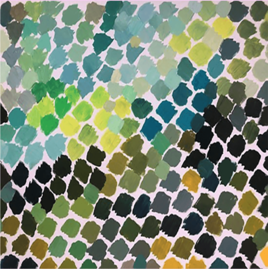
Just a few of the hundreds of greens it is possible to mix in paint
CONFIDENT COLOUR MIXING LETS ARTISTS CHOOSE THE COLOURS THEY WANT IN THEIR ART
There is no right and wrong to the colours used in art. It is about being able to use the colours that you would like to use. It is about being able to mix any colour that you would like to use and being able to replicate the mixing of any colour that you would like to use. Once you can do this confidently then your actual use of colours in your art is likely to change and become more adventurous and personal to you. Colour Mixing confidence is a wonderful thing for experimentation.
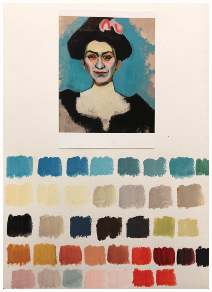
Below I have taken a painting and then made little swatches of the colours that the artist has used. Once you have understood colour mixing and can literally look at any colour and make it in paint. This demonstrates a thorough understanding of colour mixing.
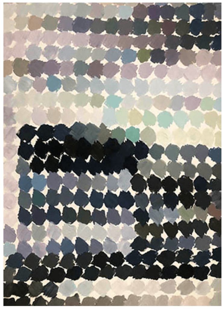
Once we understand how to mix greys we can literally mix hundreds of different shades,. Just a few of these are below.
Again, this is an exercise that is great practice. See how many subtle variations you can mix or soft gentle greys, green greys, mauve greys or really dark, gun metal greys.
AN ARTIST'S CHOICE OF COLOURS IS LIKE A CHEF'S CHOICE OF FLAVOURS
Just as artists skillfully choose and use colours to evoke emotions and tell stories on canvas, chefs in the realm of cookery wield flavours and herbs to craft culinary narratives that tantalize the palate. Just as a painter might opt for a bold, vibrant hue to convey passion, chefs might select spicy notes to awaken the senses. Conversely, subtle pastel shades in a painting might parallel the delicate infusion of a mild herb in a dish. The layering of colours in an artwork finds its counterpart in the intricate layering of flavours, each building upon the other to create a harmonious whole. Just as artists consider the interplay of warm and cool tones, chefs balance sweet and savory, acidity and richness. Just as a painter’s brushstroke can add depth and texture, a sprinkle of fresh herbs adds a finishing touch of fragrance and complexity. Both art and cookery thus engage in a dance of creativity and sensory delight, inviting us to experience the world in vibrant new ways.
SOME ART MOVEMENTS FAVOUR CERTAIN COLOUR CHOICES
Various art movements throughout history have favoured particular colours as part of their aesthetic and conceptual choices. Here are a few examples:
- Impressionism: The Impressionist movement, which emerged in the late 19th century, often featured vibrant and luminous colours. Artists like Claude Monet and Edgar Degas embraced lighter shades and a focus on natural light. Their use of broken brushstrokes allowed colours to blend optically, creating a sense of movement and atmosphere.
- Fauvism: Fauvism, led by artists like Henri Matisse and Maurice de Vlaminck, rejected traditional colour norms. Fauvist painters used bold and non-naturalistic colours to express emotion and to challenge representational accuracy. Their palette included vivid primary colours and high contrasts, creating dynamic and visually impactful compositions.
- Surrealism: Surrealist artists, such as Salvador Dalí and René Magritte, often employed dreamlike and symbolic colours. Soft pastels and muted tones were juxtaposed with intense, jarring colours to create a sense of the uncanny. This colour choice contributed to the surrealists’ exploration of the subconscious and the irrational.
- Pop Art: Pop Art artists, including Andy Warhol and Roy Lichtenstein, celebrated the popular culture of their time. They used bold, vibrant colours reminiscent of commercial printing and advertising. Bright primary colours, high viz colours and contrasts were used to convey the boldness and energy of mass media.
- Abstract Expressionism: Abstract Expressionist painters like Mark Rothko and Barnett Newman utilised colour as a vehicle for emotional expression. Rothko, in particular, used large, soft-edged blocks of colour to create contemplative and introspective atmospheres.
These art movements showcase how colour choices were integral to each movement’s philosophy, goals, and the emotions they aimed to evoke. Please look up the artists listed in the text because their work it too recent to be allowed to reproduce.
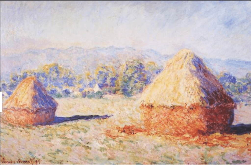
Impressionism. Grain stacks in the sunlight, morning effect by Claude Monet
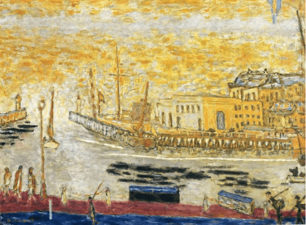
Impressionism. Trouville, the exit to the port by Pierre Bonnard
MANY FAMOUS ARTISTS HAVE EMBRACED THE USE OF BRIGHT AND VIBRANT COLOURS IN THEIR WORK
Many famous artists have embraced the use of bright and vibrant colours in their work, creating visually striking and emotionally evocative pieces. One such artist is Vincent van Gogh, whose post-impressionist masterpieces like “Starry Night” and “Sunflowers” are celebrated for their bold use of colour to convey emotions and sensations. Another notable figure is Henri Matisse, a leader of the Fauvist movement, who employed intense, non-naturalistic colours to express the essence of his subjects in works like “The Dance” and “Woman with a Hat.” Wassily Kandinsky, a pioneer of abstract art, utilised radiant hues in his works, such as “Composition VII,” to evoke spiritual and emotional responses through colour harmonies. These artists, among others, have left an indelible mark on the art world by harnessing the power of bright colours to create unforgettable and impactful visual experiences.
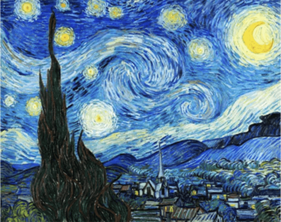
Starry Night by Vincent Van Gogh
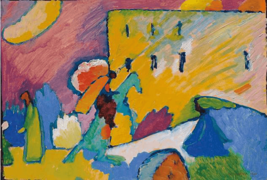
Improvised Study 3 by Wassily Kandinsky
MANY FAMOUS ARTIST HAVE EMBRACED THE USE OF THE PRIMARY COLOURS, RED, BLUE AND YELLOW
MANY FAMOUS ARTIST HAVE EMBRACED THE USE OF THE PRIMARY COLOURS, RED, BLUE AND YELLOW and many others don’t let them anywhere near their painting. Primary colours are used by several world-famous artists, who have wielded these foundational hues with exceptional skill. Piet Mondrian, a pioneer of abstract art, is renowned for his use of primary colours in his iconic grid-based compositions, such as “Composition with Red, Blue, and Yellow.” Mark Rothko, a prominent figure in the abstract expressionist movement, employed primary colours in his monumental colour field paintings, where large swaths of pure colour evoke profound emotional experiences, as seen in works like “Orange, Red, Yellow.” On closer examination of his paintings, you will see that Rothko also uses several under layers and subtle colour variations to achieve the rich depth that he does.
Marc Chagall, was a master of poetic and dreamlike imagery. He often employed primary colours alongside many others to add punch add strength and depth to his work.
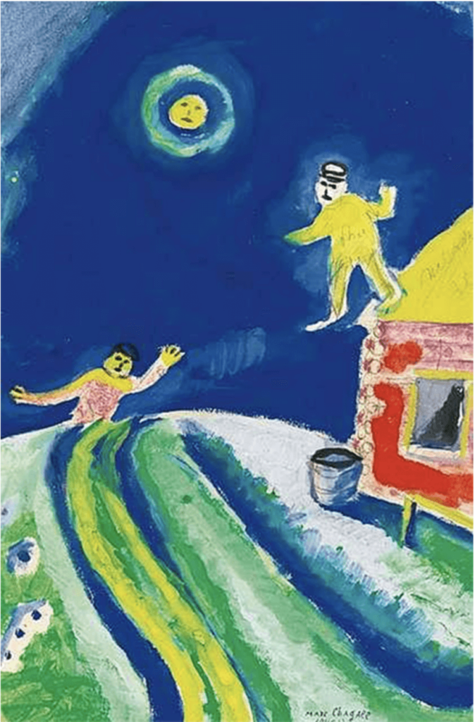
The Sleepwalker by Marc Chagall
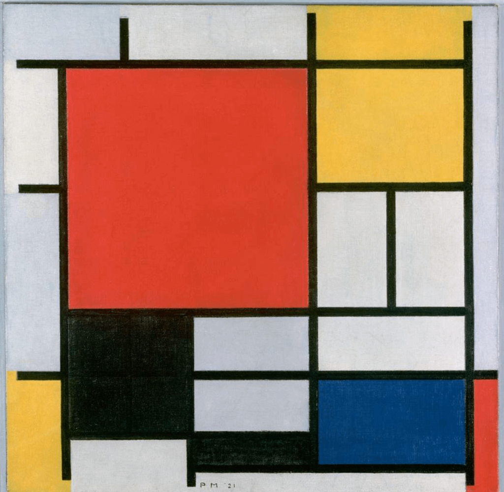
Composition in Red, Yellow, Blue and Black by Piet Mondrian
MANY FAMOUS ARTISTS USE REALISTIC COLOURS
Painters who embrace a realistic approach to colour reproduction in their work meticulously observe and capture the world around them. Their palettes mirror the hues of reality, aiming for accuracy and lifelike representation. Artists like John Singer Sargent and John Constable were celebrated for their realistic colours. They demonstrate a deep understanding of light, shadow, and the intricate nuances of the natural world.
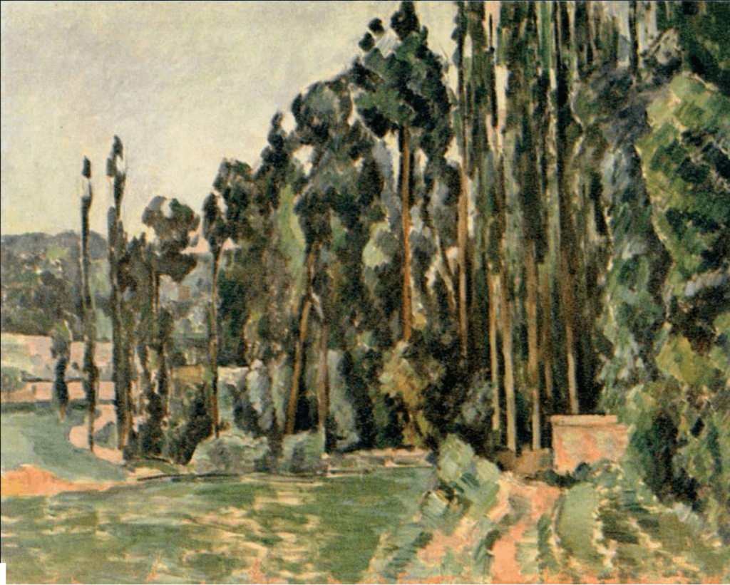
The Poplars by Paul Cezanne
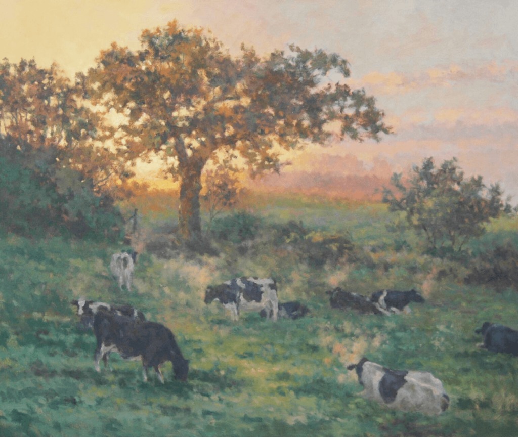
A New Day’s Dawn by Michael Cruickshank www.bradnessgallery.com
MANY FAMOUS ARTIST USE MUTED COLOURS AND TONES
Painters who embrace muted colours and tones in their work, such as Amedeo Modigliani, possess a distinct ability to convey emotions and atmospheres through subtlety. Modigliani’s signature use of soft, earthy hues and understated tones imbues his portraits with a sense of quiet introspection. Similarly, artists like Johannes Vermeer and Edward Hopper utilize muted colours to evoke a timeless and contemplative mood. These painters demonstrate that even when eschewing boldness, a carefully chosen muted palette can speak volumes, inviting viewers into a world of gentle emotion, nostalgia, and a serene understanding of the human experience.
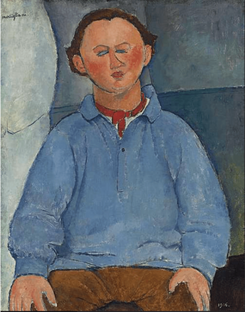
Portrait of the sculpteur, Oscar Miestchaninoff by Amadeo Modigliani
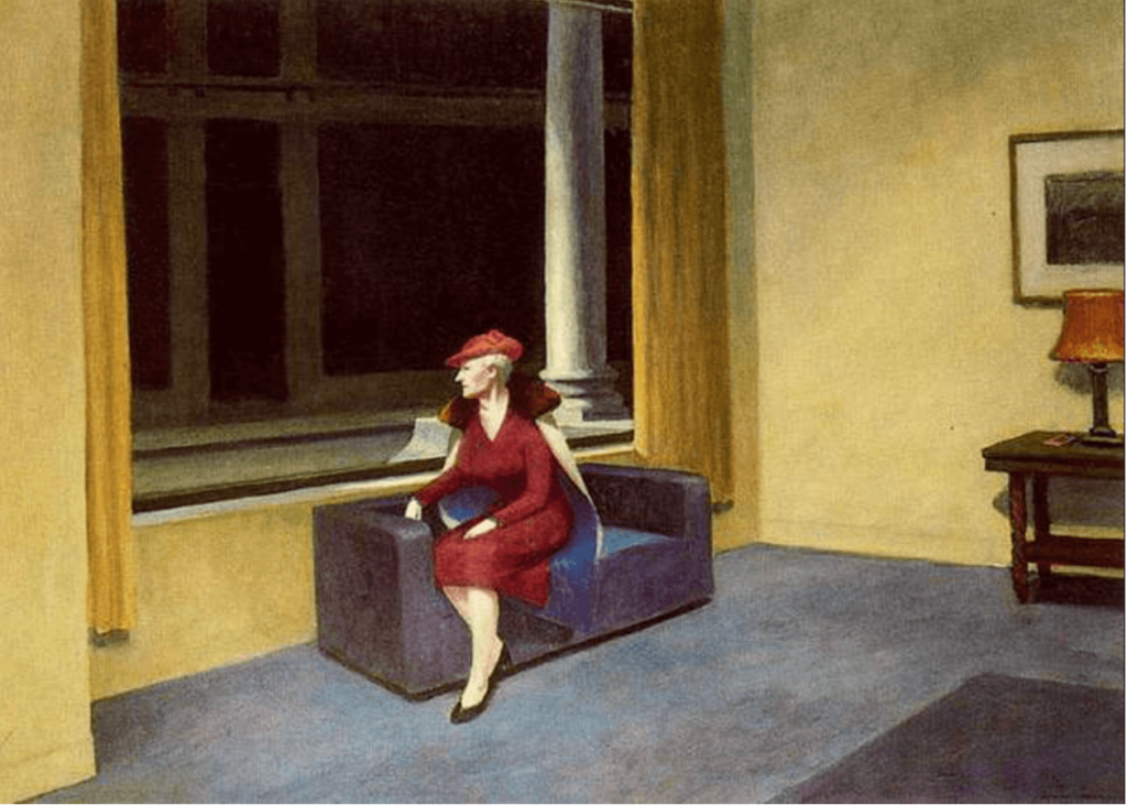
Hotel Window by Edward Hopper
THERE IS NO RIGHT AND WRONG IN THE USE OF COLOUR IN ART
I hope that the above examples clearly show you that there is no right and wrong in the use of colour in art. The point of art is that it is personal to us. It is from us. So the only limiting factor is if you are not able to mix the colours that you want to use.
THE ARTISTIC ALCHECMY OF COLOUR MIXING
In the realm of visual artistry, where every stroke of the brush and every choice of hue can convey emotion, evoke memories, and tell profound stories, the mastery of colour is an essential skill. Imagine a canvas coming alive with a symphony of colours, each shade harmonising and contrasting to create an enchanting visual experience. This is the magic of colour mixing—a fundamental technique that holds the power to transform an artist’s vision into a tangible masterpiece.
From the time-honoured canvases of the Renaissance to the vibrant palettes of the modern era, the art of colour mixing has been a cornerstone of creative expression. It is the process through which artists manipulate pigments to achieve an infinite spectrum of hues, tones, and shades. But colour mixing is more than just a mechanical process—it is an intricate dance between science and intuition, logic and emotion.
PAINTING REALISTIC LANDSCAPES AND PORTRAITS
Creating realistic and captivating artworks in both portraiture and landscape painting hinges on a foundational skill: the art of colour mixing. The ability to harmoniously blend pigments to accurately portray skin tones, natural landscapes, and the world’s myriad hues is a hallmark of skilled artists. Whether you’re a portrait painter aiming to capture the subtleties of human skin or a landscape artist seeking to convey the grandeur of nature, mastering colour mixing is essential. In this concise guide, we delve into the principles and techniques that will elevate your work to new heights of realism and vibrancy.
CRAFTING UNIQUE COLOUR PALETTES FOR ABSTRACT PAINTING
In the realm of abstract art, colour becomes more than representation—it transforms into a language of emotions and ideas. Crafting your own colour palettes is a journey of self-discovery and creative expression. The beauty of abstract art lies in its freedom to explore uncharted territories, and colour plays a pivotal role in this exploration. By curating your own colour palettes, you infuse your artwork with a distinctive identity that resonates with your artistic vision. Think beyond the conventional as you blend hues that evoke feelings, moods, and narratives unique to your interpretation. Unleash your imagination and experiment with unexpected combinations, contrasting intensities, and subtle shifts in tone. Whether you opt for harmonious symphonies or contrasting dialogues, creating your own colour palettes is about telling your story on canvas, where each stroke of colour embodies the essence of your artistic voice.
IN THE WORDS OF JULIE ANDREWS, WE NEED TO START AT THE VERY BEGINNING
To understand colour mixing we must start at the very beginning because this is where is can go wrong. Accepted teaching tells us that the primary colours are red, blue, and yellow and that they building blocks of all other hues. That they stand as pure and unaltered and incapable of being created by mixing other colours. Again this is simply not true. The basic home printer has 4 colours; CMYK which are Cyan Blue, Magenta Pink, Yellow and Black. From this it can print a range of colours but the subtleties are limited.An art printed will have at least 16 colours as the building blocks of the colours it can produce which are much more nuanced and varied. As artists using paint we need approximately 10 colours from which we can ten mix hundreds and hundreds of subtle colours and tones.
FIRSTLY PROPERLY UNDERSTAND PRIMARY COLOURS
The accepted primary colours are Red, Blue and Yellow and that they are pure colours that cannot be made. In paint colours this is simply not true. Instead of thinking of the Primary Colours as Red, Blue and Yellow we are going to start thinking of them as A Redf, A Blue and A Yellow. There is a range of colours that fit into each category and choosing the right one is vital in colour mixing. Each primary colour has component parts that affect how it mixes with other colours. Once we understand these simple component parts then we have begun our journey to understanding colours and colour mixing. If you mix magenta and yellow together you get red. Red is not therefore a pure colour that cannot be mixed. It is the yellow in red that make the brown colour when you mix it with blue. Magenta has no yellow in it which is why it makes a true Secondary colour of purple when mixed with Ultramarine Blue.
THE VIBRANT DANCE OF SECONDARY COLOURS
Secondary colours, are the progeny of primary hues. They burst forth with a vibrancy that commands attention on any canvas. The secondary colours are green, orange, and purple. These hues carry the vivacity of their parentage while possessing a unique character all their own. Green brings nature’s vitality to life, orange ignites warmth and energy, and purple exudes regal depth. Secondary colours serve as the bridge between the foundational and the complex, offering artists a spectrum of possibilities to infuse their creations with life, emotion, and bold visual impact. Just as the blending of musical notes creates rich chords, the interplay of secondary colours elevates artistic expression to a symphony of chromatic delight.
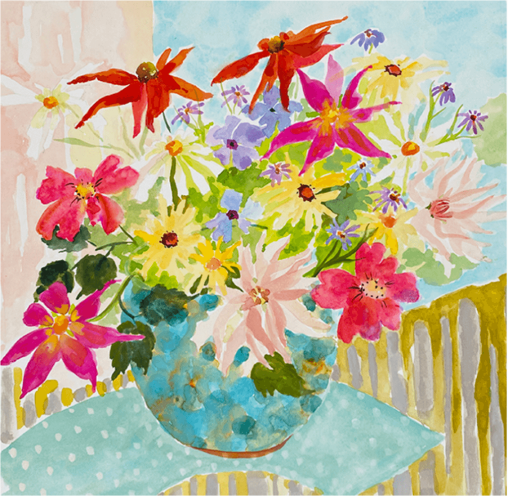
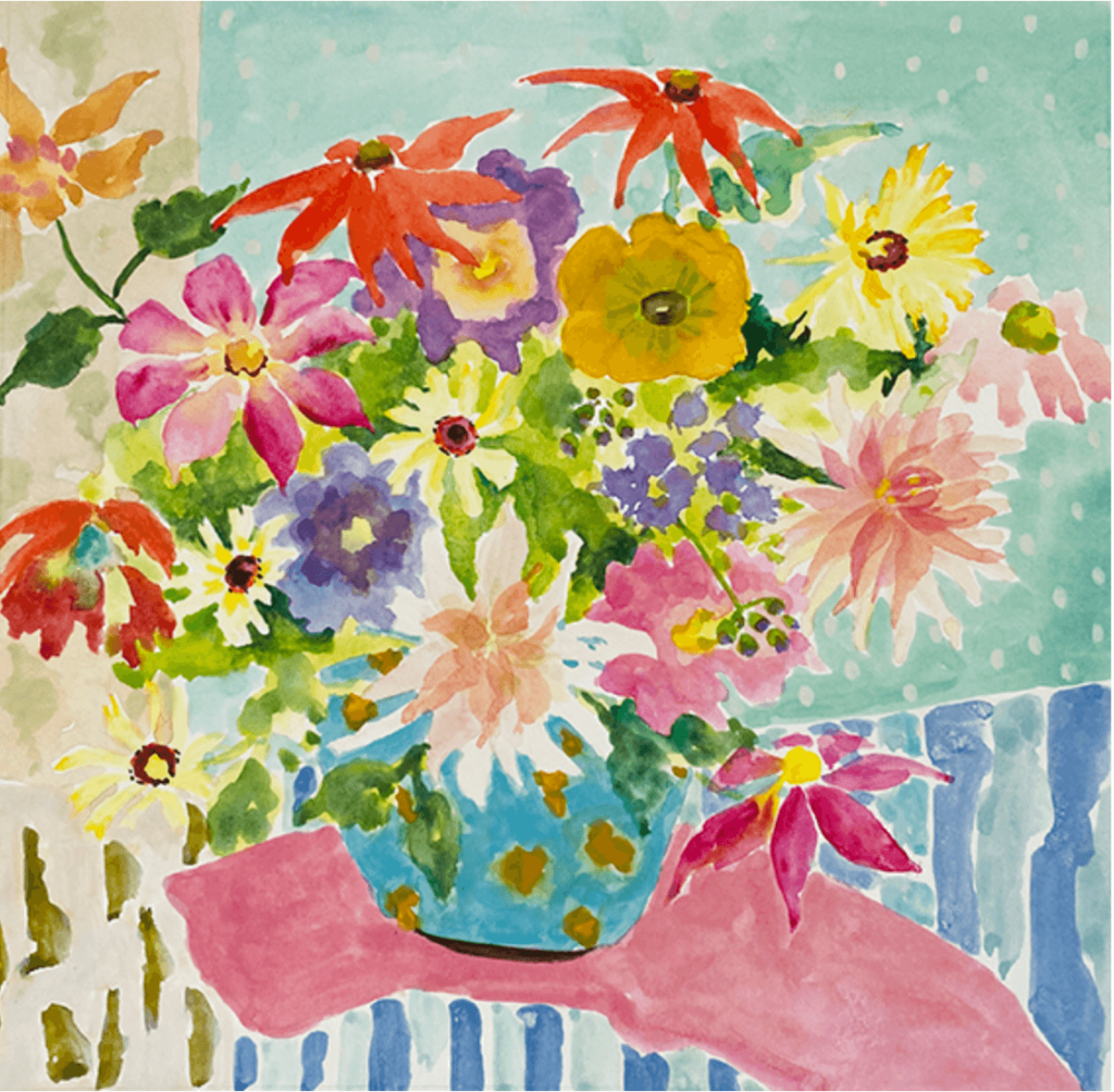
The two paintings below contain some vibrant secondary colours; bright orange, bright green, mauve and purple together with muted and more complex colours, sludgy colours and contemporary pastels. This variety brings life and vigour to the colour palette.
NOW YOU CAN MOVE ON TO CREATING COMPLEX COLOURS
Once you have learnt to mix the clean and vibrant colours, you can then learn the complex ones; the sludgy plums, the bottle greens, a range of greys and browns and neutrals. These nuanced shades result in a symphony of visual depth. Complex colours beckon viewers to unravel their multilayered stories, offering a palette rich in subtlety and intrigue. From earthy ochres that whisper of ancient landscapes to muted mauves that evoke twilight’s embrace, these shades possess a transformative power. Artists wield complex colours to capture the nuances of reality and emotion, embracing the delicate balance between vividness and restraint. With each brushstroke, the canvas becomes a narrative of possibilities, showcasing the profound beauty that emerges when colours intertwine in mesmerising complexity.
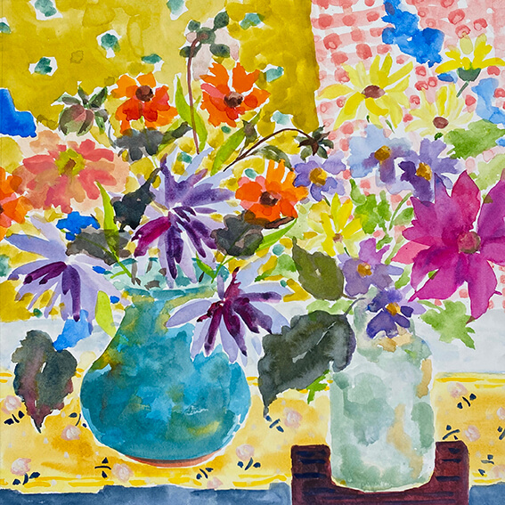
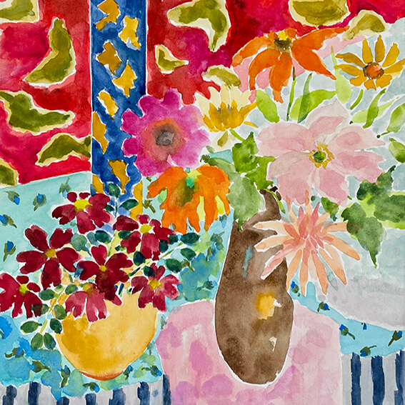
Inspired by Matisse by Emma Burnett
COLOUR MIXING FOR ARTISTS CONTAINS AROUND 8 HOURS OF COLOUR MIXING TUITION
The Online Colour Mixing Course contains 8 hours of Colour Mixing Tuition. What a difference a day makes. In one day you will be able to mix 500 different greens and the exact shade you want. You will be able to mix and replicate any colours. You will know to create colour consistency or contrast. You will truly understand colour.
EMMA'S TWO SIMPLE RULES OF COLOUR MIXING
Once you have completed the Colour Mixing section of the course, you will have learnt my Two Simple Rules of Colour Mixing. These serve to easily remind you of what you have learnt.
WHY ARE EMMA'S TWO SIMPLE RULES OF COLOUR MIXING SO IMPORTANT?
Artist’s paints can vary considerably in myriad ways. Richard Pikesley, the former president of the NEAC uses 3 different makes of yellow ochre because they are all different. Different companies have different names for colours and different companies source their pigments from different places and make the paints up differently so a colour such as Magenta can vary from one manufacturer to another. The is why colour recipes don’t work. You need to be able to look at the colours and see where it lies for colour mixing.
When you understand paint colours in this way, you do not need a different course for each type of paint. What you learn applies to colour mixing in paint, whatever the medium. Most of the demonstrations are in acrylics, simply because they show up very well on videos. But you can then mix all these colours in watercolour, gouache, or oil paints.
ESSENTIAL PAINT COLOURS
These are my suggested colours if you wish to purchase paints. The makes I have recommended are my personal favourites. I have listed watercolour paints and acrylics. I personally use Michael Harding oil paints and also gouache and fabric paints However the colours listed here should give you a good guide.
Acrylic Paint Colours.
I use Golden acrylics. These are top quality. System 3 are good student colours and cheaper.
Main colours you need
Cadmium red medium
Cadmium yellow medium
Titanium white
Yellow ochre or raw sienna
Lemon yellow
Ultramarine blue or Cobalt blue
Quinacridone magenta or Sennelier Deep Magenta or Golden medium magenta
Burnt Umber
Teal or Permanent green
Ivory black
Extra colour
Titanate yellow
Watercolour Paint Colours.
I use Winsor and Newton. Buy professional colour if you can or the student quality called Cotman if your budget is less. This make is my personal favourite.
Main colours you need
Quinacridone Magenta
Lemon Yellow, Bismuth Yellow or Winsor Lemon
Ultramarine Blue or Cobalt Blue
Cobalt turquoise light
Cadmium red
Cadmium yellow
Yellow Ochre
Burnt Umber
Extra colours
Ivory black
Viridian
Permanent Sap green
Raw sienna
DIFFERENT QUALITY OF PAINT
Within the realm of painting, there exists a distinction between artist-quality and student-quality paints. Artist-quality paints are renowned for their superior pigments, offering richer, more vibrant colours that maintain their brilliance over time. These paints often boast a higher concentration of pigment and a wider range of hues, allowing artists to achieve nuanced and complex effects. On the other hand, student-quality paints are tailored for those still honing their skills. While they may have a lower pigment concentration and a narrower colour range, these paints are often more budget-friendly. They are an excellent choice for learning and experimentation, allowing emerging artists to explore techniques and styles without the investment of artist-quality materials. The choice between artist and student-quality paints depends on an artist’s goals and level of expertise, offering a range of options to suit various artistic journeys.
USING A LIMITED COLOUR PALETTE
Using a limited colour palette in painting comes can be a great advanatge. When you stick to a handful of colours, things surprisingly start falling into place. Your artwork gets this natural sense of togetherness, like all the elements are best friends. Mixing and blending become a sort of meditation, helping you play with different shades and create harmonious effects. A limited colour palette can create cohesion in your work.
THE COLOUR WHEEL
The artist’s Colour Wheel is an indispensable tool that stands as a guiding beacon in the world of colour theory. This fundamental instrument simplifies the complexity of colour relationships, offering artists a structured roadmap to navigate the vast spectrum of hues. The Colour Wheel isn’t merely a circle with colours; it’s an authoritative compass, steering artists towards harmonious compositions, enriching narratives, and a profound understanding of the chromatic universe. Understanding the Colour Wheel helps us to understand. colour in paint and how to mix it. It is an incredibly simple tool that reminds us how colour works.
The order of colours in the colour wheel is the same as the order of colours in a rainbow or from a prism. However, once again a word of warning here. Not all colour wheel that you may find in books or on search engine images are correctly laid out.
COLOUR MIXING FOR ARTISTS - A FINAL WORD
I truly hope that this article has inspired you on the subject of colour. I feel passionately that it is the subject that artists and would be artists will enjoy so much. After reading this colour blog, are you feeling that spark of curiosity and inspiration? I hope that you are now eager to dive deeper into the world of colour and enjoy taking your colour palettes to the next level. My course is all about demystifying the art of mixing and using colours effectively in your work. Whether you’re a beginner or a seasoned creator, I’ve designed it to be accessible and enriching for everyone. So, if the blog got your creative wheels turning, imagine what you could achieve with even more in-depth knowledge. Let’s keep that inspiration alive and take a step closer to mastering the vibrant language of colours!
Recognized as a distinguished professional artist and educator, Emma Burnett brings decades of experience to the world of art education. With an exceptional talent for simplifying intricate concepts, Emma Burnett is a seasoned course creator renowned for making complex topics approachable. Her thorough understanding of art and keen ability to convey it in a relatable manner have empowered countless students, establishing Emma Burnett as an authority in teaching art. A driving force in the industry, she continues to inspire both novices and experienced artists alike, shaping a new era of artistic excellence

